Google Pay is one of India's leading UPI platforms, processing over 1.2 billion QR scans and 1 billion transactions every month. As a Product and Visual Designer on the team, I worked across the bills and recharge experience — reducing drop-offs, designing new features, and building systems that could scale across the app.
At Google Pay's scale, a 1% drop-off translates to millions of lost transactions. The bills and recharge flows had measurable friction — users abandoning mid-flow due to missing feedback, confusing plan information, and no guidance when things changed. Each of these was a solvable problem with a direct fix.
Beyond fixing drop-offs, high-traffic surfaces like the recharge landing page and QR scanner were being underused. There was an opportunity to drive revenue and brand recall from screens that were already getting millions of visits a day.
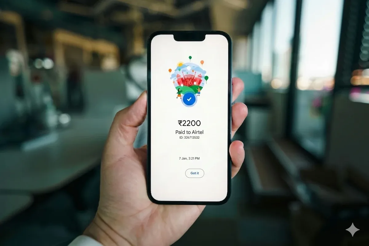
When adding a new bill on Google Pay, users were abandoning mid-flow at a significant rate. Research showed the cause: the bill entry screen and the confirmation screen (which shows fetched details like name and address) looked nearly identical. With no visual feedback that the app had done anything, users assumed something had gone wrong.
I introduced a bottom sheet with a checkmark to confirm successful bill linking, and an explicit loader to communicate that Google Pay was actively fetching details. Both changes shipped for 100% of users and reduced drop-offs.
A confirmation bottom sheet and an explicit loader gave users the feedback that linking had actually worked.
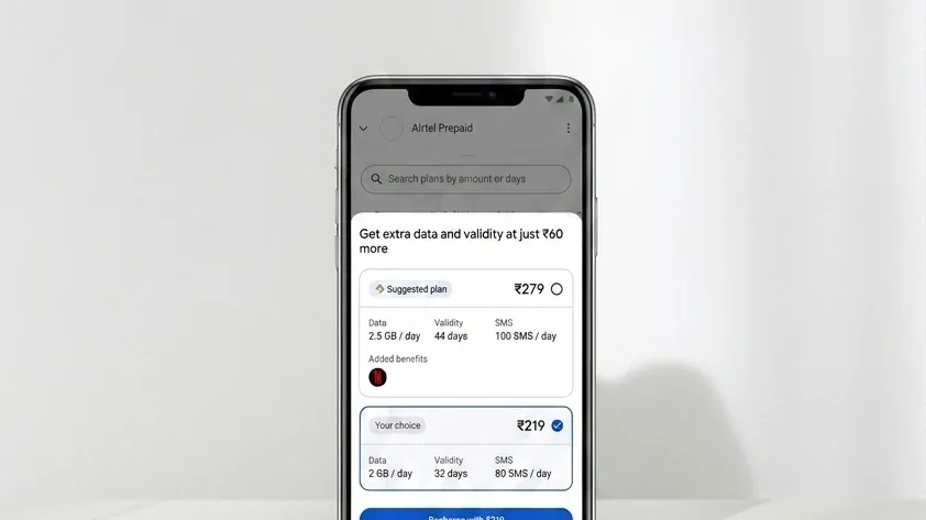
Telcos like Airtel and Jio started offering alternative higher-value plans with added benefits alongside their standard ones — but users were completing recharges without ever seeing them. Research confirmed the two things that actually moved users to upgrade: validity and extra benefits.
After a user selected their plan, I introduced a bottom sheet showing curated alternatives, leading with those two variables. A 'Suggested for you' tag kept the tone optional. The feature nudged users toward higher-value plans without interrupting the main recharge flow.
Telcos frequently change their plan prices and offerings. When users tried to repeat their last recharge and found the plan missing or at a different price, many assumed Google Pay had changed the amount — and switched to a competitor. I added contextual messaging to explain exactly what had changed (discontinued, unavailable, price updated), and surfaced the closest available alternative on the same screen to keep users moving.
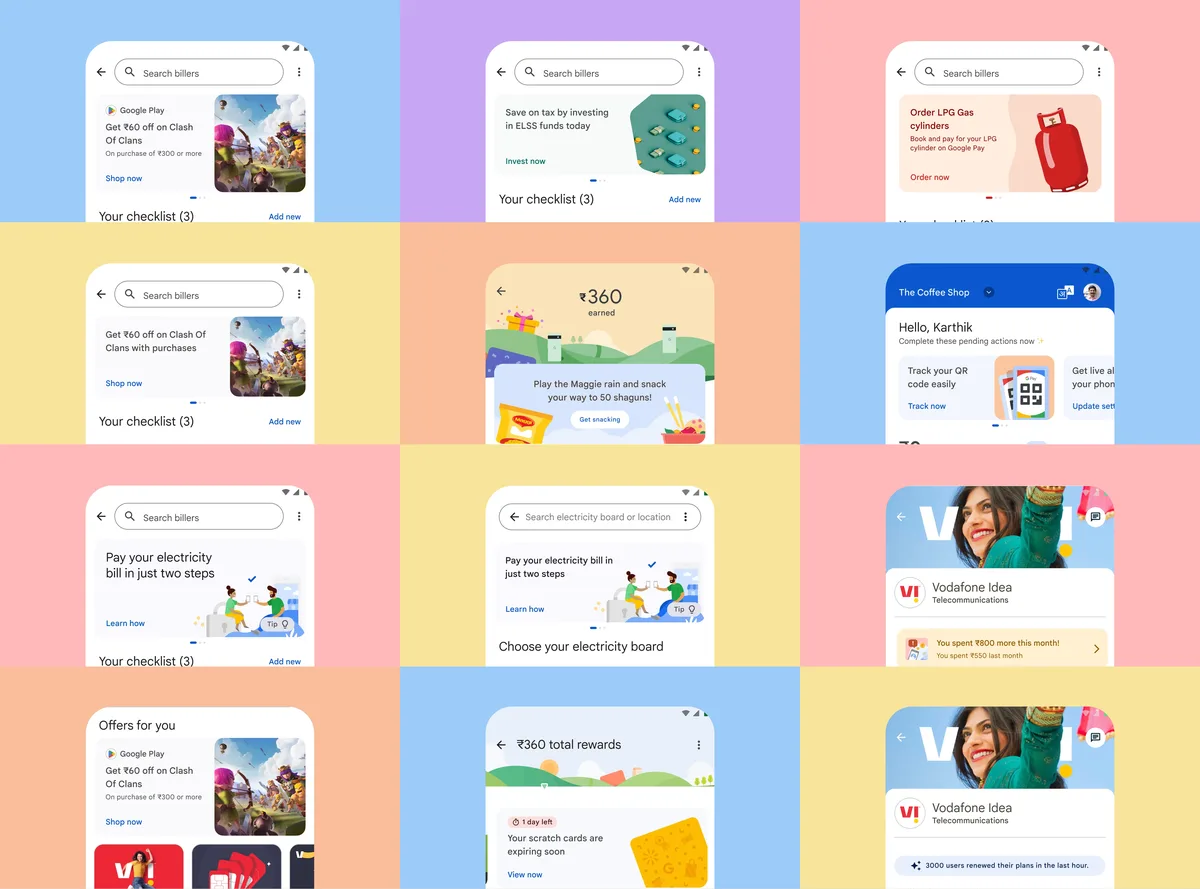
Contextual messaging explains exactly what changed about a plan and surfaces the closest alternative on the same screen.
The recharge landing page had the highest traffic in the bills section — a natural place to surface offers and campaigns. But different teams were doing their own merchandising independently, with no shared templates or placement strategy. The result was inconsistency and a fragmented experience.
I led the design of a merchandising framework — placement guidelines and scalable templates built to work for current and future use cases across teams. It gave the whole organisation a consistent system to work from and prevented individual teams from fragmenting the app with one-off solutions.
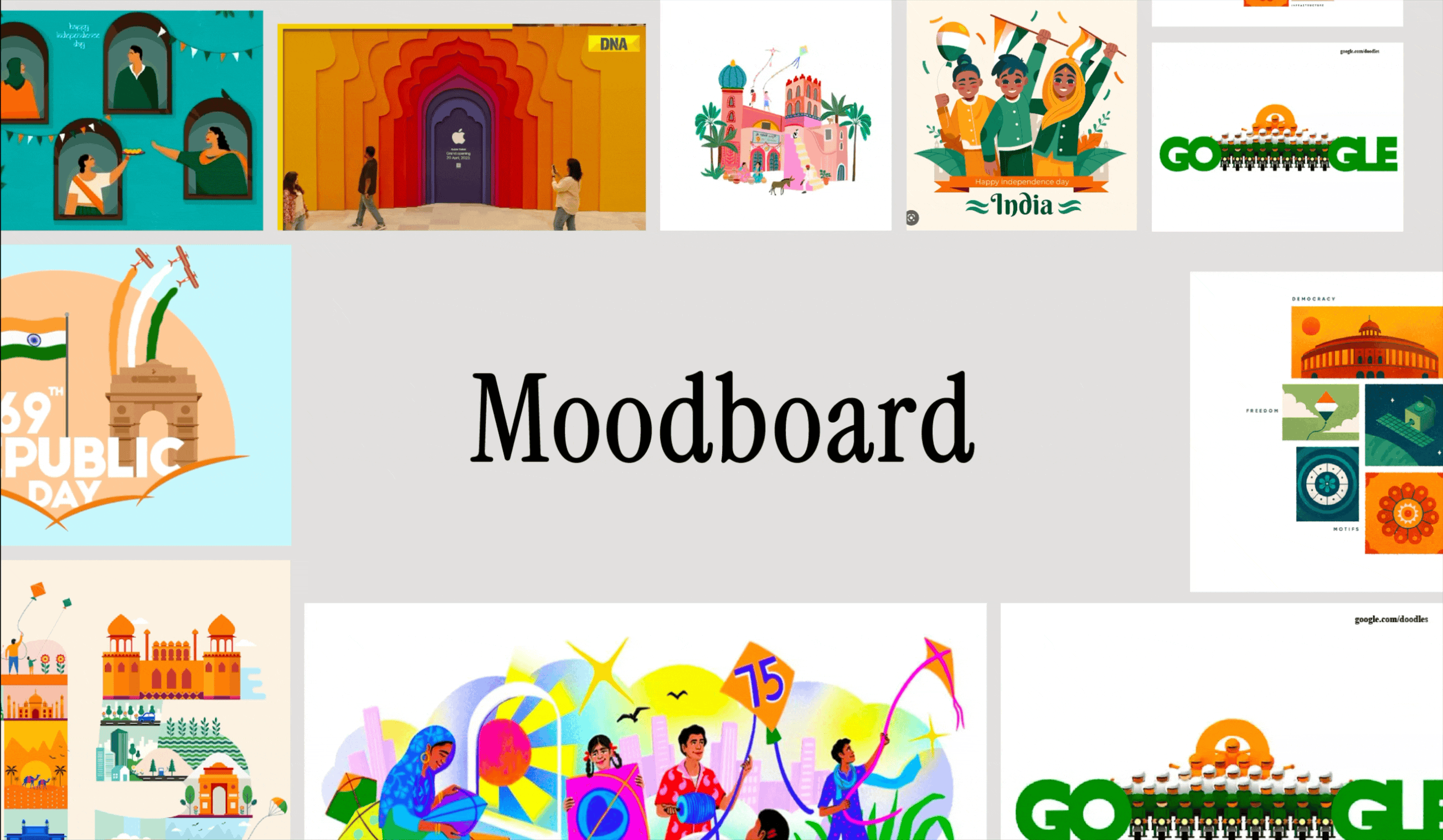
The Independence Day campaign brought the QR scanner its first brand moment, shipped at zero performance cost.
The QR scanner processes over 1.2 billion scans a month — but had never been used for brand campaigns. Any lag on the scanner would cause immediate drop-offs, so performance was non-negotiable. I initiated a rapid design sprint to explore how engaging elements could be added from home screen to success screen without touching performance.
Working with an illustrator and motion designer, and iterating constantly with engineering to keep lag at zero, we launched the Indian Independence Day campaign on the scanner. It ran for a full week. After that, implementing animations on the scanner and payment success page took less than a day.
The bill-linking and recharge fixes shipped to 100% of users, cutting drop-offs across the highest-traffic flows in the bills section at a scale where a single percent is millions of transactions.
The merchandising framework gave every team a shared system to work from, ending the one-off campaigns that had been fragmenting the app.
The QR scanner ran its first-ever brand campaign with zero added lag, and the pattern it established meant new animations there could ship in under a day.