I was part of the core team that redesigned PhonePe — one of India's largest digital payments platforms, with over 600 million users. In early 2025 we shipped PhonePe 3.0, a ground-up rebuild driven by a single shift in direction: from a payments app to a full-spectrum financial platform covering insurance, mutual funds, gold, savings, and loans.
My work spanned the homepage IA, a new merchandising system, the app's first-ever search experience, and visual language explorations — all in close collaboration with product, engineering, and senior stakeholders across the organisation. Tens of designers, close to 100 engineers, 800+ screens.
PhonePe 3.0 spanned the homepage IA, a new merchandising system, the first search experience, and a refreshed visual language.
Users knew PhonePe for payments — the broader financial services were invisible to them. The app looked and felt like a 2015 product in 2025, which was actively pushing away the tier-1 urban audience the business needed to reach. At the same time, 80% of the business ran through just four actions: P2P payments, QR scans, recharges, and bill payments. Any structural change that disrupted those flows had direct, measurable revenue consequences.
The app had no search. For a platform with dozens of financial products and 600 million users, that meant wayfinding was fundamentally broken. If you didn't already know where something lived, you were unlikely to find it. That was the third problem I was working against.
Serving 600 million users, but still looking and feeling like a 2015 product in 2025.
Three months of exploration before a single direction was locked. I was working on a different homepage concept every day — iterating on layouts, IA structures, visual hierarchies, and interaction patterns. The goal was to find something that felt genuinely new without triggering the kind of disorientation that would show up in drop-off rates the next morning.
In parallel I was managing alignment across product, business, and engineering — a complex organisation where almost everyone had a strong opinion about the homepage. My anchor throughout was simple: protect the four core actions that drive 80% of the business, and use everything else to grow the rest.
A selection of the daily homepage explorations from three months of searching for a direction.
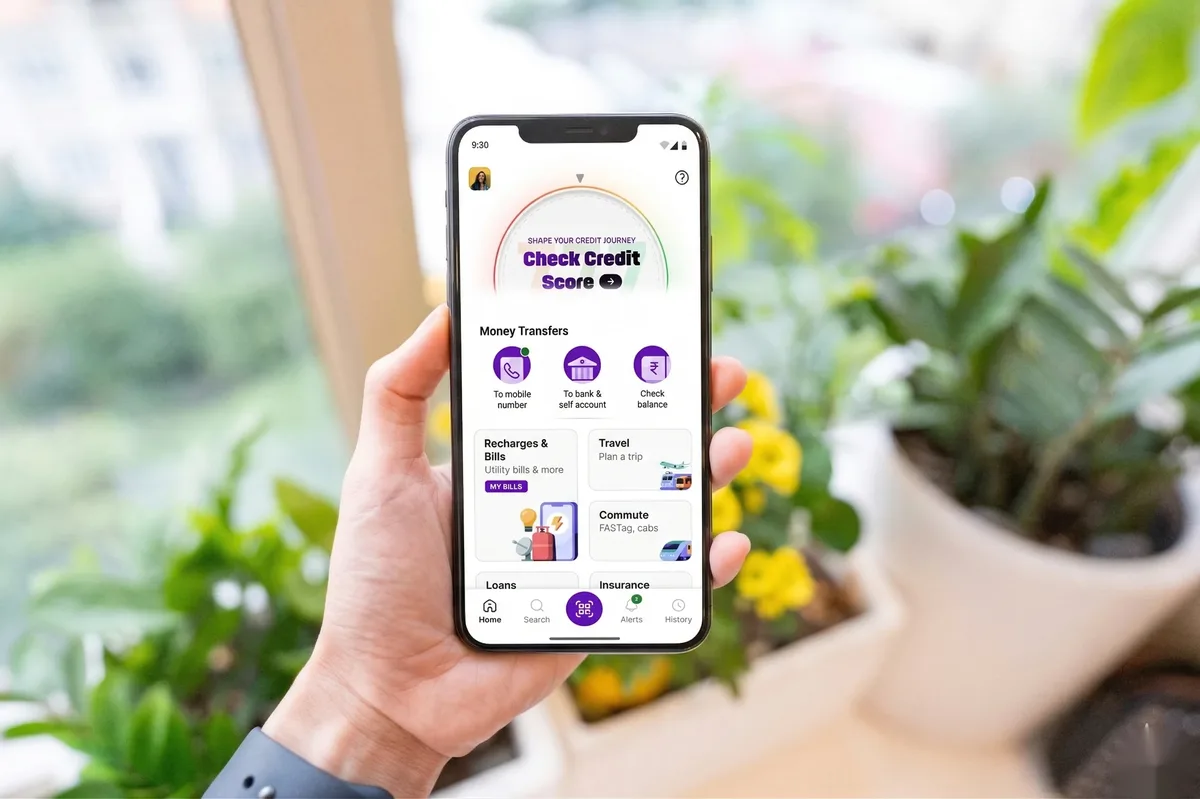
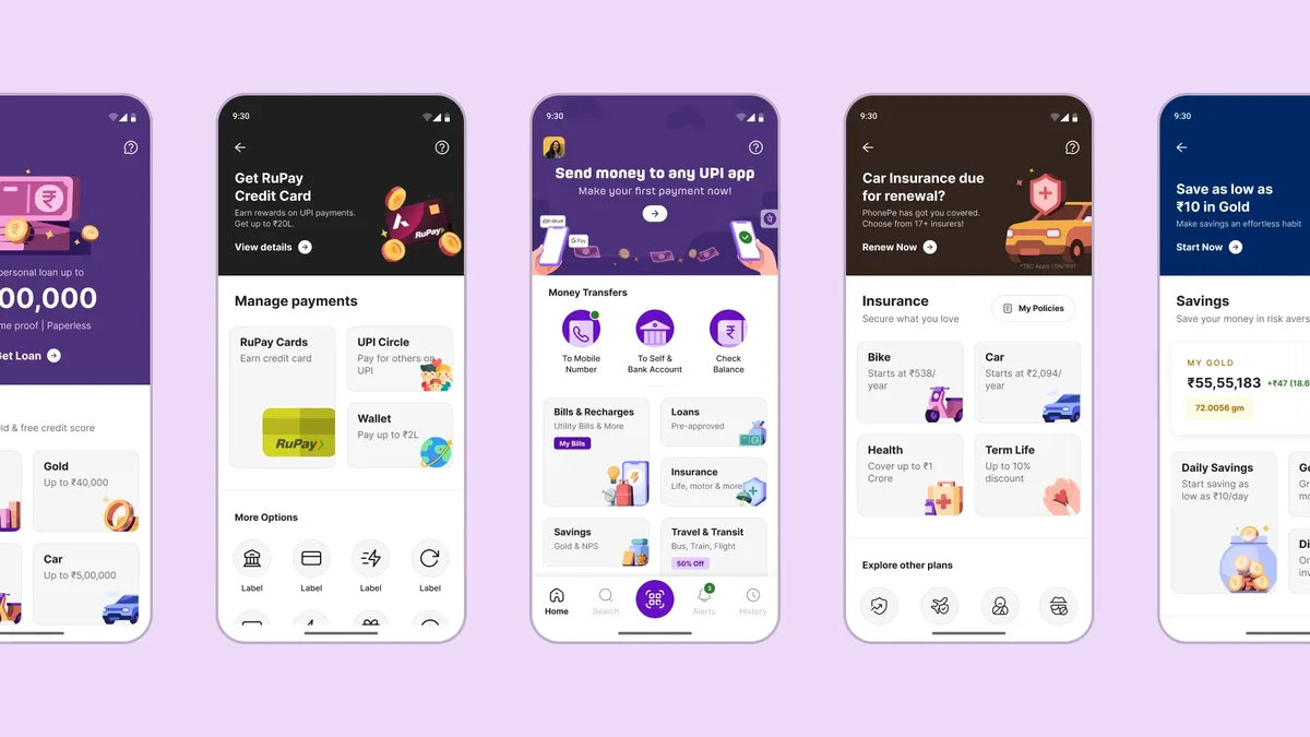
The existing homepage was an icon-heavy grid — functional, but visually dense and unable to show the breadth of what PhonePe had become. I moved away from grids toward contextual, grouped layouts that gave each category room to breathe.
Services like RuPay Credit and UPI Circle, previously buried deep, were surfaced naturally within the flow. Mutual funds and insurance got above-the-fold presence for the first time. And the four core actions — send money, scan QR, recharge, check balance — stayed exactly where users expected them. Keeping those fixed was what gave me the freedom to change everything else.
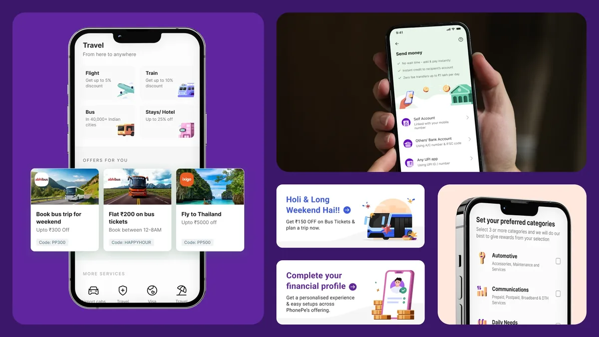
Across the app, offers and campaigns were being handled differently by each team — no shared framework, no consistency. The result was banner blindness and an experience that felt stitched together. I designed a new end-to-end merchandising system: templates and guidelines flexible enough for future use cases, but consistent enough to feel native rather than bolted on.
I explored high-contrast treatments for high-impact moments and subtler approaches for ambient discovery. The goal was merch that felt contextually relevant rather than interruptive. The new system made campaigns faster to test, better looking, and much less likely to produce the banner blindness that had made earlier efforts ineffective.
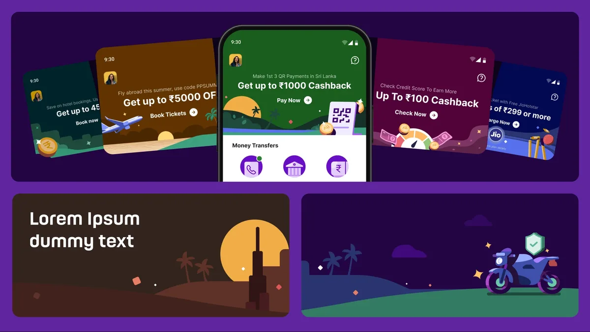
The merchandising system: flexible templates that stay consistent across campaigns instead of producing banner blindness.
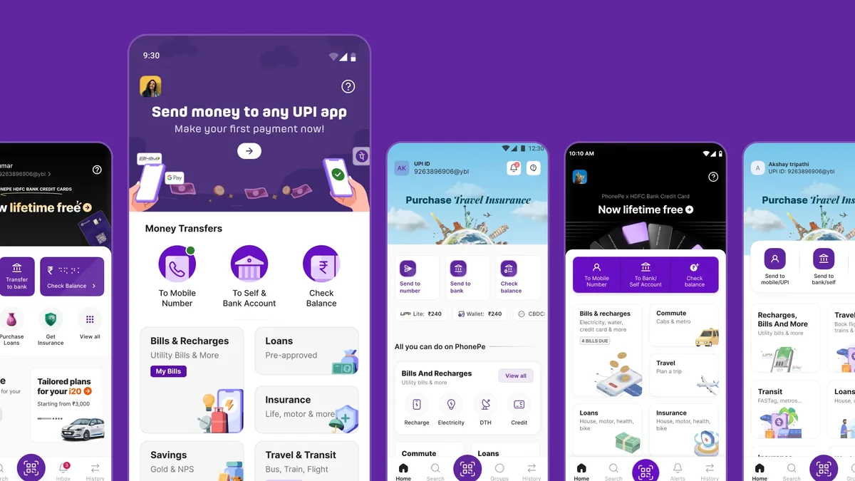
No search, on an app with 600 million users and dozens of financial products. I built PhonePe's first search experience from scratch — handling everything from payments to mutual funds to utility services, surfaced based on what users were actually trying to do, not just what they typed.
For new users it became a way to orient themselves without navigating a complex IA. For power users it became the fastest route to whatever they needed. It changed the app from something you had to navigate into something you could just ask.
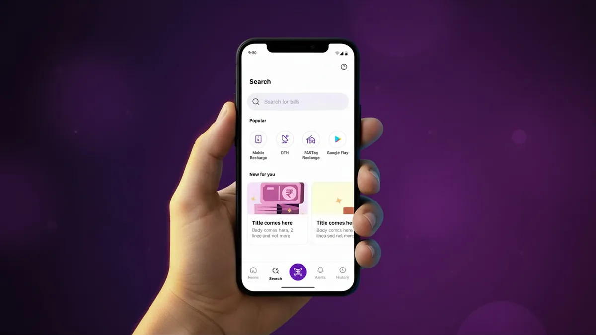
PhonePe's first search, surfacing products by what users are trying to do, not just what they type.
Beyond structure and features, the visual language needed work. Years of fast shipping had left behind a lot of inconsistency — each screen functional on its own, but nothing cohering into a product that felt considered.
I worked on new interaction patterns and visual treatments — transitions, states, micro-moments that made the app feel alive. Polish that didn't slow anything down.
PhonePe 3.0 shipped in early 2025, the result of tens of designers and close to 100 engineers collaborating across more than 800 screens. The redesign moved the app from a payments utility to a financial ecosystem.
Critically, the redesign was built on top of a new design system, Mint DS, that fundamentally changed how fast the team could ship. Future updates that would have previously taken years can now be executed in under 7 months.
The work also changed how the team collaborates. With a shared language across design and engineering, handoffs that once required extensive back-and-forth now happen in hours — a shift in process that outlasts any single feature shipped.