India is not a single user. It never has been. Designing for it means designing for contradictions — and getting comfortable with that.
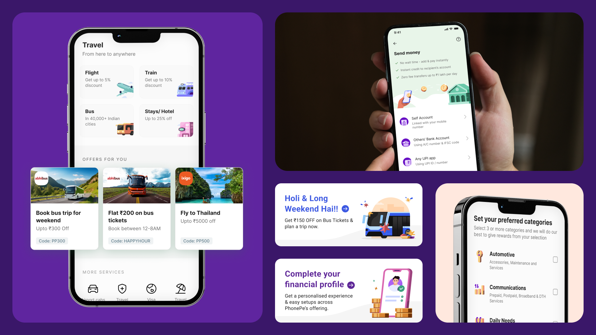
When I was designing at PhonePe, we had a single product used by a rickshaw driver in Patna, a salaried software engineer in Bangalore, a kirana store owner in Rajkot, and a retired government employee in Lucknow. All of them used the app to pay for something. None of them thought about it the same way.
The rickshaw driver wanted to know if the money went through. The engineer wanted the transaction to be invisible — fast, done, forgotten. The kirana owner needed to see daily settlement data. The retired employee was cautious, needed every step confirmed, and would abandon a flow at the first sign of ambiguity. Same product, four completely different mental models. Four different definitions of what "working" means.
The problem with personas at scale
Most product teams in India design from the middle. You build a persona that represents the average — urban, educated, smartphone-native, English-comfortable — and you ship for them. It's not laziness. It's practicality. You can't run research sessions with 600 million people. You have to make calls.
But what I've found, working across products that serve genuinely diverse populations, is that designing from the average doesn't produce a product that works for the average. It produces a product that sort of works for a narrow band of people and invisibly fails everyone else.
The failures don't always show up in drop-off rates or support tickets. They show up in the way your most price-sensitive users never discover the feature that would save them money. Or in the way the feature you spent three months on gets used by 8% of your base because you assumed everyone reads labels. Or in the way a UI that feels clean and minimal to you feels empty and confusing to someone who grew up navigating dense, high-information environments.
Language is not a localisation problem
India has 22 officially recognised languages and somewhere between 780 and 1600 dialects depending on how you count. English fluency correlates closely with urban geography and income level, which means the further you push into Tier 2 and Tier 3 cities, the more you're designing for people who can read Hindi (or their regional language) but may read English slowly or not at all.
The standard solution is localisation — translate the strings, ship in Hindi and six other languages, call it done. But localisation that happens at the end of a design process is just translation. It doesn't change the fundamental structure of the interface, the density of the text, the reading level assumed by the copy, or the order in which information is presented.
I've seen localised products that are technically correct — all the words are in Hindi — but structurally designed for someone who thinks in English. The sentence structures are borrowed from English, the error messages assume a certain kind of literacy, the help text is three paragraphs where one line would do. The translation is there. The design is not.
Good design for diverse linguistic populations starts before the copy is written. It starts with how much you're asking users to read at all.
The device split is real and it matters
India is also one of the most diverse device markets in the world. At the top end, you have users with the latest iPhones, fast internet, and plenty of storage. At the other end, you have users on 2GB RAM Android devices, 2G or patchy 4G connections, and storage so constrained they delete apps after using them.
The instinct is to design for the best experience and progressively degrade it. The problem is that "degraded" often means "broken" — animations that stutter, images that never load, flows that time out halfway through. A user on a low-end device doesn't experience your product as a simplified version of the premium experience. They experience it as a product that doesn't work.
At Dunzo, the homepage redesign I worked on wasn't just about product discovery — it was also about page weight. A grid that showed more products in fewer server calls, images that loaded at the right resolution for the device, layouts that rendered before the full JS bundle was parsed. These were as much design decisions as visual ones.
Trust works differently at different income levels
Here's something I think about a lot: the relationship between income and risk tolerance in digital products.
For a user managing ₹50,000 a month, a ₹500 mistake in a transaction is annoying. For a user managing ₹8,000 a month, the same mistake is a week of groceries. The same payment failure — same error message, same UX — lands completely differently depending on what's at stake. And the product has no way of knowing.
What this means practically is that you need to design for the version of the user for whom getting this wrong matters most. More confirmation moments. More explicit feedback. More forgiveness in the flow. These things can feel like friction to power users — and they are — but they're the difference between trust and abandonment for users with less room for error.
The tension here is real. Friction costs you at the top. Insufficient confirmation costs you at the bottom. The answer isn't to pick one — it's to design flows where confirmations feel like progress, not delays. That's harder than it sounds.
What it actually means in practice
I don't think there's a framework that solves for this. The designers who do it well share a few habits:
They do research outside their own city. They test with people who don't look like them, don't earn like them, and don't speak the same language at home. They pay attention to what users do, not just what they say. They treat drop-offs not as funnel problems but as comprehension problems — someone didn't do the thing because they didn't understand what the thing was asking.
They also resist the instinct to simplify. Simplicity for a specific user type is not simplicity for all users. What feels simple is relative to what you're used to. A user who grew up navigating a dense, high-information environment — a busy street, a crowded market, a physical bill — may find a minimal UI confusing precisely because it gives them so little to orient themselves with.
The goal isn't to make the simplest product possible. The goal is to make a product where every user, regardless of their device, their language, their income, or their prior exposure to similar software, can figure out what to do next.
That's a much harder brief. And it's the one India gives you whether you ask for it or not.